First Look at a Stock Chart
What is a stock chart? What are candles? What am I even looking at? These are all essential questions that every trader learned to answer.
What is a Stock Chart?
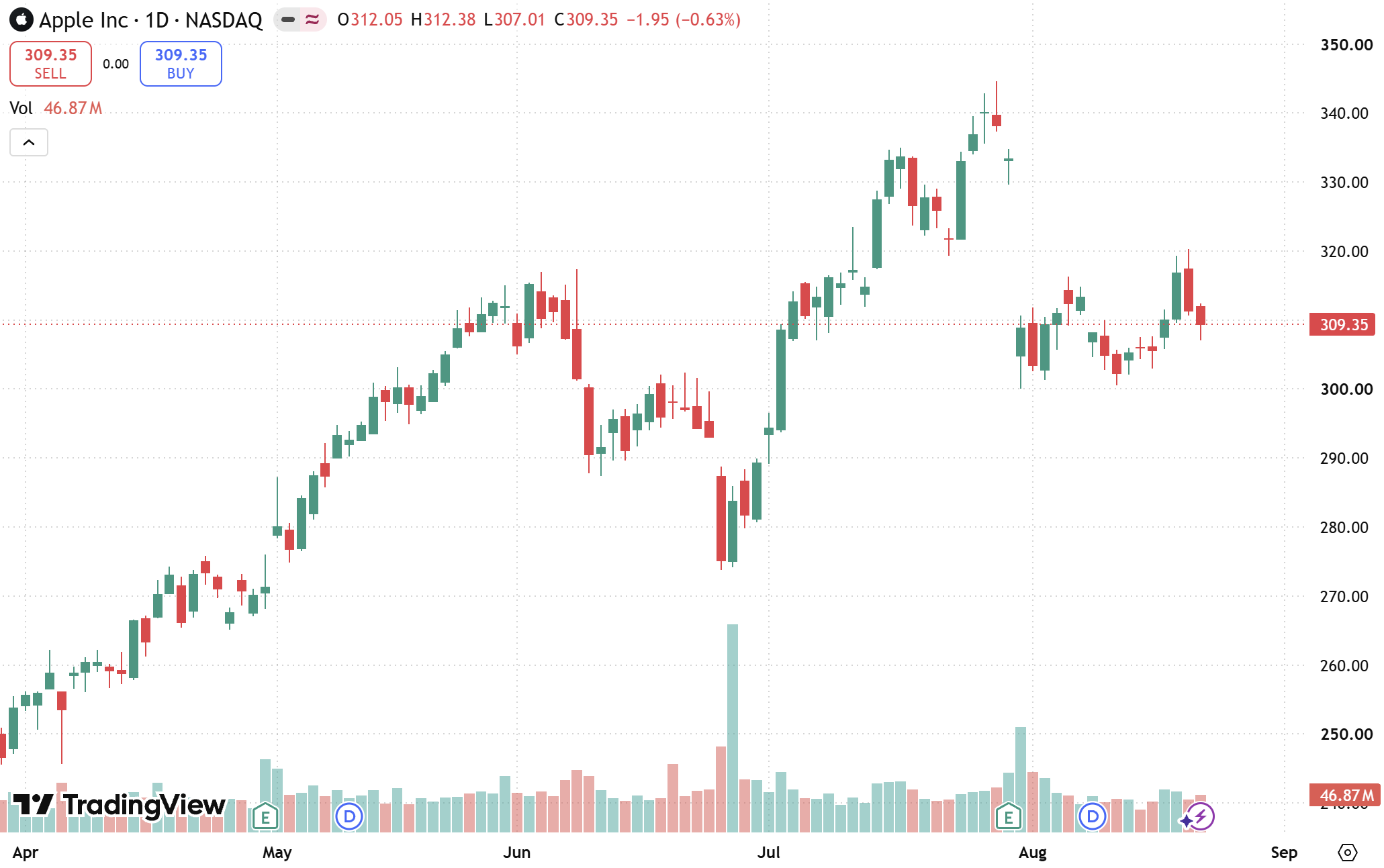
One of the first pictures that come to mind when you think about stocks is a Stock Chart. These charts illustrate the price of a stock throughout a time period.
For example, the image down below depicts the stock chart of Apple (Ticker: AAPL).
What is a Candle?
Looking at the AAPL Chart, you can see a bunch of rectangle markers in either red or green. These are called Candles. Candles indicate the fluctuation of a time period you set. The chart above has 1 day candles, which means each candle indicates the range of prices.
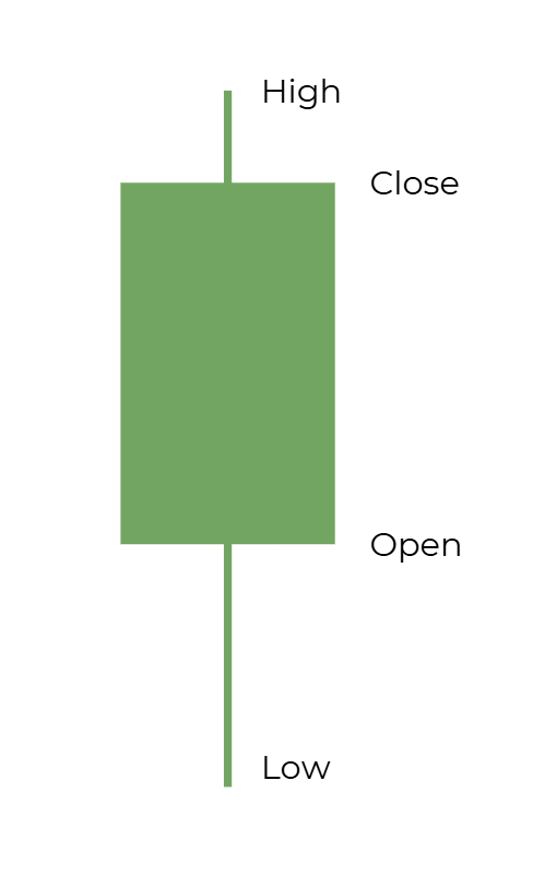
On the right is a diagram of a singular candle. The candle is made up of the body and the wick. The body is the main rectangle shape, and the wick is the thin line that extends above and below the candle.
First, the wicks of the candle represent the highest and lowest pricest during the period. The body of the candle represents the open and closing prices that the stock went through during the timeframe selected. A green candle is bullish, or profitable. That means the closing price is higher than the opening price. On the other hand, a red candle is bearish, meaning that the price went down during the timeframe.
The reason we describe candles as periods rather than days, is because candles are not limited to what the price is daily. Candles can represent the price of the stock every minute, hour, day, week, and much more.